A representation of visual impairments: color blindness and dyslexia, blue blindness and double vision, green blindness and blurred vision.
Accessibility affects more than just design
Starting in June 2025, the European Accessibility Act requires companies to comply with accessibility requirements for individuals with disabilities when offering their products and services.
Accessibility isn’t just a design issue—it impacts every department involved in corporate communication, including Human Resources, IT, Marketing, and Communication.
As many factors are involved in ensuring accessibility, we’ve put together some practical tips and tricks, including helpful links.
What is accessibility?
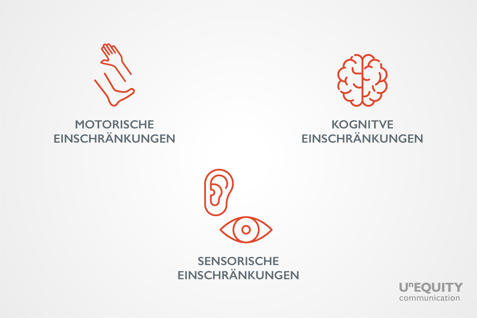
According to the principles of Diversity, Equity, and Inclusion (DEI), people with physical, sensory, or cognitive impairments should have the same opportunities as those who do not have impairments. First, let us look at the existing barriers to accessibility and how we can address them with user-friendly design.
Three major types of impairments exist: motor (top left), sensory (center), and cognitive (top right).
7 Tips – Practical ways to improve accessibility
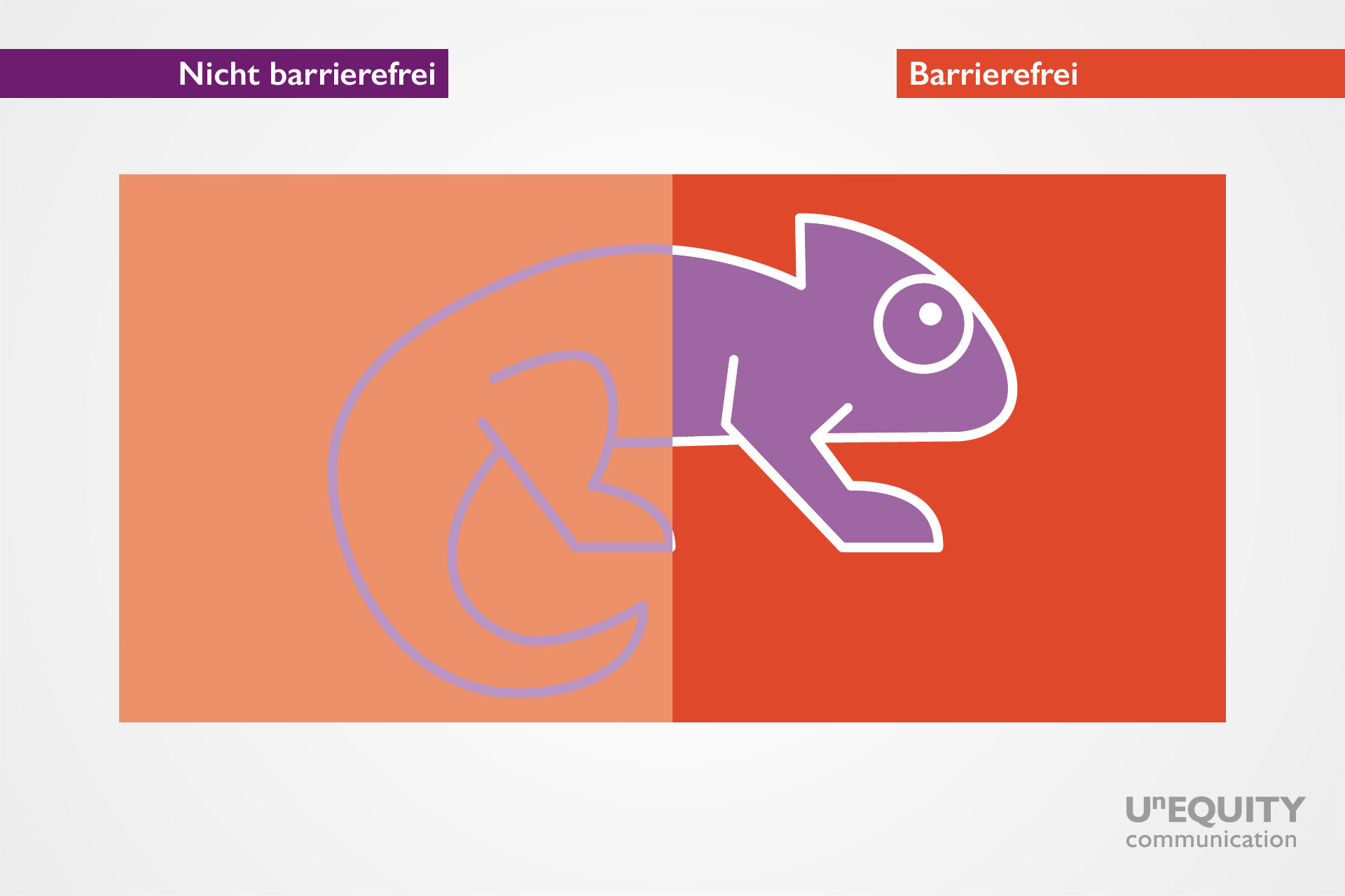
Tip 1: Use high-contrast colors
A visual representation of non-accessible vs. accessible color palettes.
Use colors with high contrast values to emphasize differences. This applies to backgrounds and fonts.
Be careful when combining colors and symbols to make it easier for users. Combinations that are easy to distinguish for many people may be challenging for those with impairments.
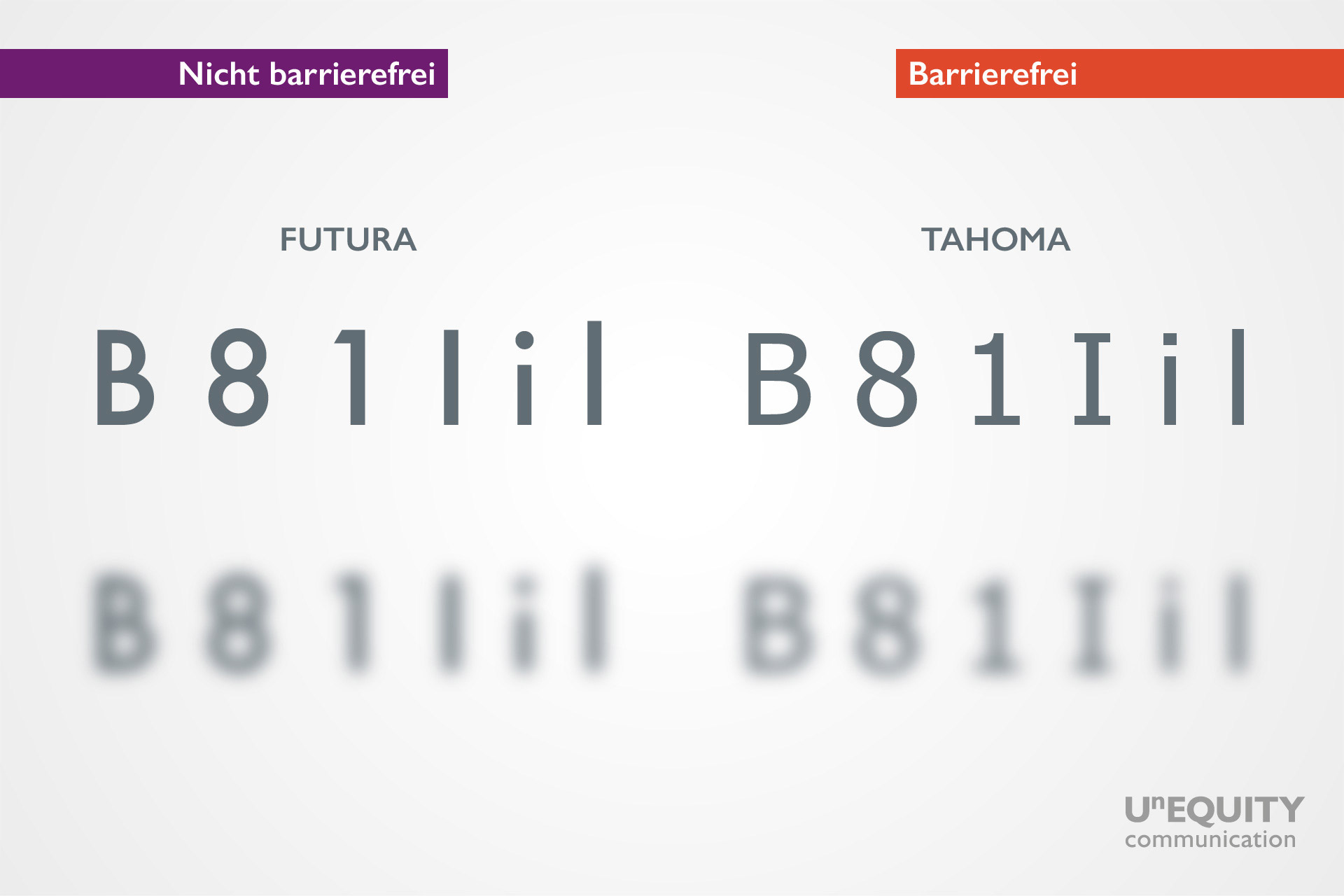
An example for how fonts can impact accessibility: left-hand side is not accessible, while right-hand side is accessible.
Choose clear and distinctive font sizes. Headlines should be 18 or 24 points, while body text should be between 9 and 12 points.
Avoid using all capital letters, which can reduce readability.
For very small texts, use a light font.
A good test for readability is the combination B+8,1+I+i+l.
The DIN standard 1450 on fonts provides more in-depth guidance on this typography.
Line spacing and layout – As a rule of thumb, line spacing should be 1.5 times the font size. However, you can trust your design skills and vary this when it makes sense.
⇒You can find helpful hints about choosing a suitable font here: 99Designs
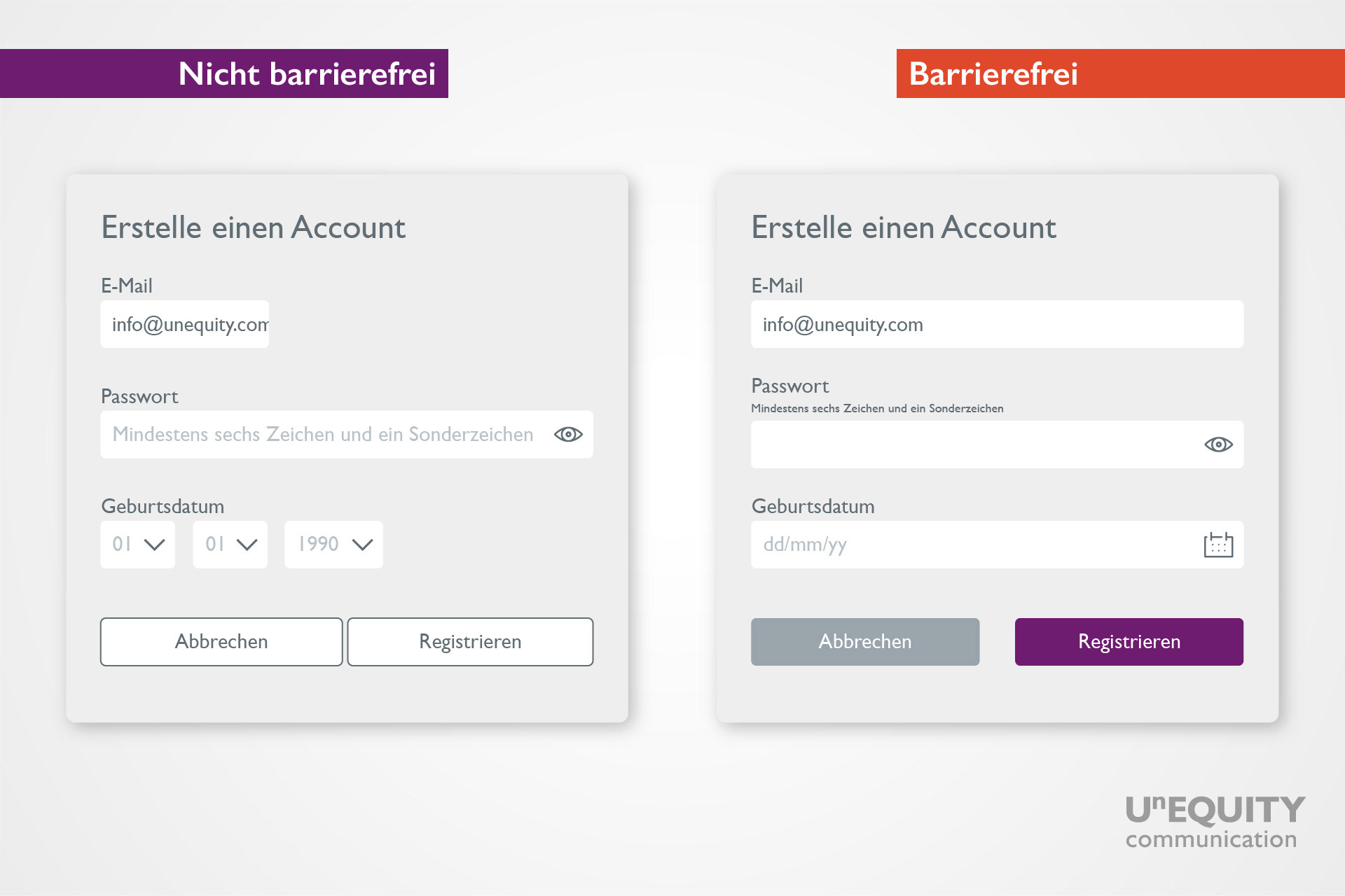
Tip 3: Design user-friendly links, buttons, input fields, and forms
Interactive user design can also be optimized to improve accessibility by using high contrasts and the right layout.
Links and buttons: Use distinct colors for these elements to help differentiate them from the surrounding text.
Remember: Links are for navigating (going), while buttons are for actions (doing). Good design choices make this distinction clearer.
Input fields should be large enough to be easily recognizable.
A calendar can make the selection of a date easier.
Place explanatory texts below the input field, and clearly label required fields.
Visually highlight active fields and place any error message directly below the field in question.
In forms, a reading direction from left to right and top to bottom makes them more readable.
Another way to improve readability is a clear layout
Tip 4: Arrange images and icons clearly
A design with differentiated colors and high contrasts, combined with proper labels, improves readability.
In our visual world, clear graphics are particularly important.
Select strong images with a clear central motif.
Don’t forget alternative text (ALT), which is essential for screenreader users.
Use icons with high contrast and combine them with text labels when possible.
Tip 5: Use clear language that is easy to understand
Use simple, clear sentences.
Use the Flesch Index to test the readability of your text. It measures the average syllables per word and the average sentence length.
The recommended language level is 45-50 on this scale.
You can test your content for readability on free tools such as this one – Flesch Index.
Tip 6: Add subtitles and autoplay to videos
Always subtitle videos. AI tools can generate subtitles quickly.
Autoplay can increase accessibility
Make sure your video player supports keyboard navigation.
Tip 7: Check your website for accessibility
An accessibility checker can be an excellent tool to identify potential pain points.
Use free tools such as silktide to check the accessibility of your website.
If you need to do more regular checks, consider the paid version.
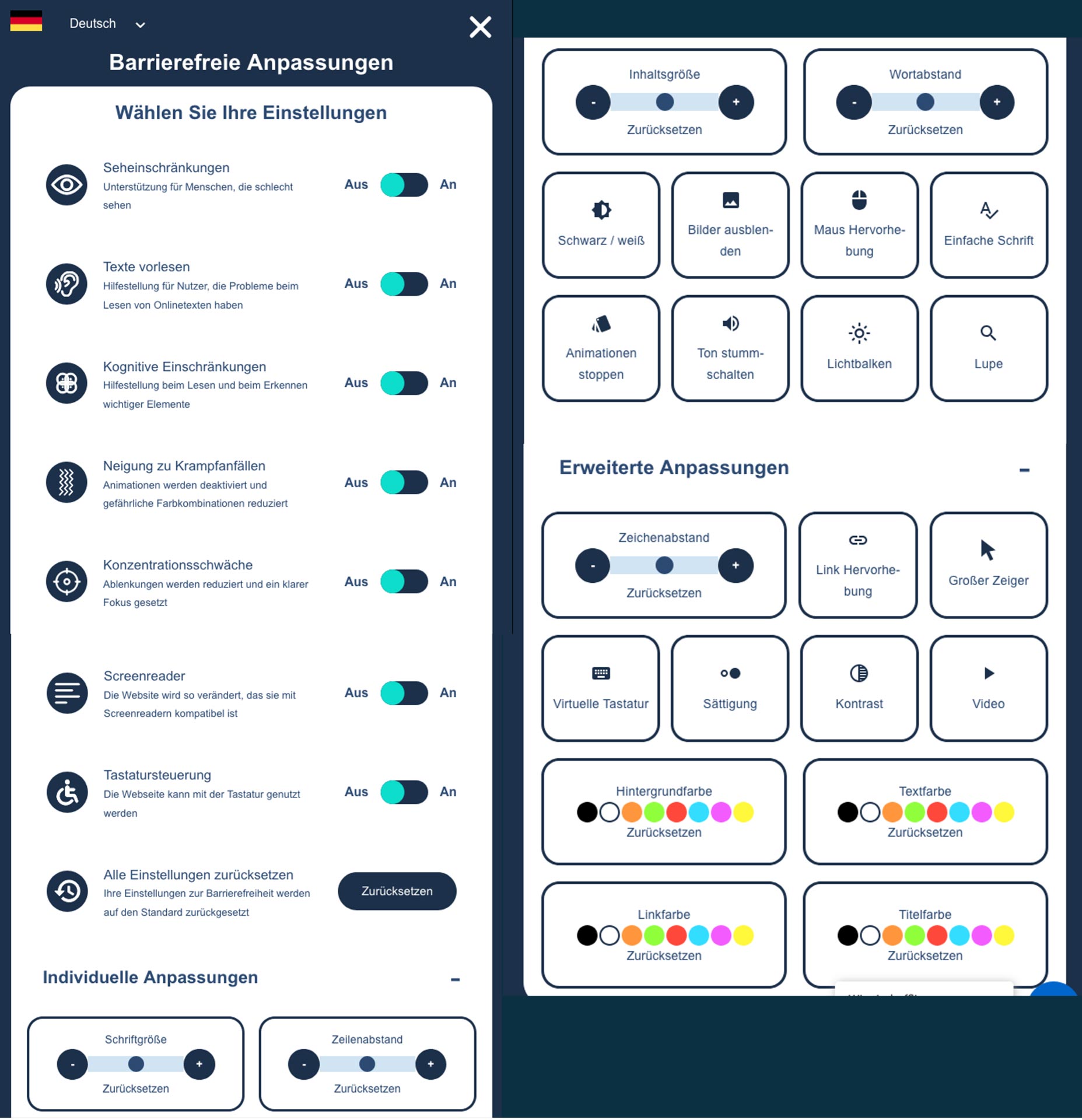
An excellent example of an accessible website is the online presence of our customer, Merck KGaA, which offers customizable views for different sensory needs.
The company achieved this using the Digiaccess tool.
Summary
You can use these tips to improve the accessibility of your digital content in just a few steps. Improving accessibility doesn’t only benefit people with impairments, it enhances the overall user experience of everyone who engages with your content—as we discussed in our blog post, How accessibility can become your competitive advantage.
This article was published on
CONTACT US
If you’d like to chat about this, or any other topic, get in touch with us.
We lead People-Projects to success through communication.